

Nutricas
Nutricas is an app and a responsive website so that children can learn more about nutrition and have a healthier lifestyle.
Project duration:
3 weeks
Target Audience:
Children who need and want to learn more about nutrition. Together with this, the caregivers and the family.
My role:
UX Designer; Creating the entire application from the beginning to the end of the project.
Responsibilities:
Conduct research, create paper and digital wireframes, create low and high fidelity prototypes, conduct usability tests, iterate, interpret results and create responsive design.
The problem:
A study by UFRJ shows that only 22.2% of Brazilian children aged 6 to 23 months are fed preferably with vegetables and fruits, to the detriment of industrialized products. It is important to understand that this is a multifactorial problem, linked to a lack of resources, but also due to a deficient food culture.In this context, children are being introduced to ultra-processed products with a high sugar content at an increasingly younger age. Thus, the need to make nutrition something more proximal and knowledgeable for children arises.
The objective:
Nutricas is an interactive guide for the whole family to build healthy and uncomplicated eating habits. With Nutricas, children and parents have fun while learning about healthy eating and creating habits that last a lifetime.
Research
3X
of the global average
"The proportion of children who are overweight or obese (14.2%) is almost triple the global average (5.6%). That of adolescents (31.2%), almost double (18.2%). "
Fiocruz Child Health Observatory, based on data from the Ministry of Health
"Understanding the importance of nutrients is fundamental to ensuring healthy growth and creating an environment conducive to children's development."
Marcia Juliane Rebolhedo Chagas
portion of overweight children is

The report shows, for example, that 42% of school-age teenagers in low- and middle-income countries consume sugary soft drinks at least once a day and 46% eat fast food at least once a week.
UNICEF report
53% of children up to 2 years old consume ultra-processed foods
Report on the Food and Nutritional Situation of Paraná, released by the State Department of Health (Sesa)
Sources:
BANDNEWS FM CURITIBA EDITORIAL. 53% of children up to 2 years old consume ultra-processed foods, according to research. BandNews FM Curitiba, 28 March. 2024. Available at: https://bandnewsfmcuritiba.com/53-de-criancas-ate-2-anos-consomem-alimentos-ultraprocessados-aponta-pesquisa/. Accessed on: 16 May. 2024.
THE GLOBE. Childhood obesity requires policies to encourage healthy eating. O Globo, Opinião, 15 Dec. 2023. Available at: https://oglobo.globo.com/opiniao/editorial/coluna/2023/12/obesidade-infantil-exige-politicas-de-incentivo-a-alimentacao-saudavel.ghtml. Accessed on: 16 May. 2024.
SUMMIT HEALTH TEAM. Nourishing the future: the importance of maintaining adequate infant nutrition. Summit Saúde, 22 June. 2021. Available at: https://summitsaude.estadao.com.br/novos-medicos/nutrindo-o-futuro-a-importancia-de-manter-uma-alimentacao-infantil-adequada/. Accessed on: 16 May. 2024.
UNICEF BRAZIL. Poor nutrition harms children's health around the world, warns UNICEF. UNICEF Brazil, 19 Nov. 2021. Available at: https://www.unicef.org/brazil/media/5566/file/Situacao_Mundial_da_Infancia_2019_ResumoExecutivo.pdf. Accessed on: 16 May. 2024.
Seeking user understanding
Based on research, part of the challenges of child nutrition in today's world was perceived. This helped us define the app's target audience: children, with access for guardians to monitor the skills developed and usage time
.png)
.png)
Competitive audit
In the competitive audit, the main idea was to evaluate the designs, projects and educational as well as evaluation and gamification methods of their apps and websites, in addition to prices and needs.
.png)
Competitor analysis revealed the scarcity of apps and websites focused on child nutrition. Existing solutions focus mainly on parents, while understanding the importance of good nutrition must be conveyed directly to children. Our app fills this gap, promoting autonomy and benefiting the whole family
Findings
Mobile first
The Brazilian Internet Steering Committee carried out a survey in 2022 where it was pointed out that the most used device among children and adolescents is the cell phone, which is why the choice was made to create Nutricas primarily with an application in mind.
Before going to the wireframes, I created an "App Map" document that guided me mainly on the main features that the app would need, thus making the ideation moment even more focused on finding solutions aimed at the application's needs.
_page-0001.jpg)
Source:
FEDERAL GOVERNMENT. Use of screens by children and adolescents. ParticipaMais Brasil Platform, 2024. Available at: https://www.gov.br/participamaisbrasil/uso-de-telas-por-criancas-e-adolescentes. Accessed on: 16 May. 2024.
Bring the idea to tangible
The wireframes on paper were an important part of the process, as they defined what the application creation process would be like, from onboarding to the configuration and usability flow of the home page containing games, stories and much more.
Onboarding frames
_page-0001.jpg)
_page-0002.jpg)
Wireframe digital aplicativo
The digital wireframes were important to understand the application of the frames in reality and also to create the first prototype to carry out the usability study with a view to seeking improvements in the application.
View the app's digital wireframes at this link
.png)
Thinking about the website
With the application basically fully structured in its draft, it was thought that it would be ideal to carry out the usability study with the application and the website structured, allowing the user to compare and perceive aspects of improvement in both.
Therefore, inspired by the "App Map", a sitemap was created, thinking about how to adapt the central functions of using the app to the web, adding more resources for parents and allowing a robust and at the same time practical website to access.

Wireframe digital website
View the digital wireframes of the website at this link
.png)
Usability study
The usability study was very important to determine relevant points for improving the app, especially regarding the functionality of the application as well as the website
To this end, we carried out a moderated usability study remotely, conducted in the homes of the 3 participants analyzed. We prioritized 3 problems to be corrected in order to improve the usability of the website.
1
66% of those surveyed made some kind of observation regarding the scrolling on the home page of the site, saying that it is confusing and difficult to locate the home elements . The solution was to bring titles closer to icons, favoring an understanding of unity.
.png)
The title of "videos" was too far from the icon to click on items on the website
.png)
Approximation of the header with the icons present, creating unity
Before the usability study
After the usability study
2
30% of those surveyed noted that there was a lack of explanations on how to use the app and that was why they had difficulties. The solution was to create basic tutorials on how to use the app, ensuring a better user experience


A motion component was created, with the hand icon showing the movements related to the operation of the touch
3
Noticing the behavior of those surveyed, none of them dragged the slider to the side, clicking continue as soon as they saw it.
The insight was to leave the continue only on the last slide, thus forcing the user to go through the entire flow.
After the usability study
Component created


Before the usability study

Continue button only on the last slide


After the usability study
In addition to these main findings in the usability study, other items stood out, but will be prioritized in the future with the continuation and refinement of the app, some of them were even incorporated in the continuation of the project.
Priority 1
-
1 of those surveyed said that the recipe part could have a search, an insight is: create a search so users can find what they want.
-
30% of those surveyed said that the part of the profile where a broccoli appears is confusing as to what it is since there is a notifications part next to it, an insight is: to improve this it is possible to remove the image exchange function from the configuration and leave changing the image just for the profile photo, making the app more dynamic.
Priority 2
-
60% of those surveyed said that exploring could contain less texts and add more videos and images, an insight is: Realizing if the app has a lot of texts.
-
1 of those surveyed said about putting the student's arrival time and how much time they spent per day in the caregiver's space, an insight is: Create a separate part in the calendar for this.
-
1 of those surveyed said that it would be nice for the child to have a task a day to motivate entry.An insight is: Create your own part before the person enters the home page with daily challenges and medals if they complete the day.
Designing the form of the app and website
The choice of reddish and greenish colors refer to food, convey dynamism to the website and harmonize with the brand's visual identity. The website's componentization followed the standards and characteristics of the app, ensuring a cohesive and intuitive experience for the user.
The Nutricas
Returning a little about the site's functions, Nutricas was designed to be a guide for children to learn more about nutrition in a fun way and support parents in their children's nutritional education.
With this in mind, very interactive mechanisms were created to access stories, games, food exploration, recipes and videos for children while parents have access to the child's progress in relation to nutrition knowledge in the caregiver's space.
.png)
Parallel app home screens and website home page
In view of the research carried out, it was understood that children tend to use the app more on their tablets and cell phones than on their computers, for example. That's why we thought of a website more focused on the needs of parents while the app encompasses more of the child's needs and dynamism.
The website became more explanatory, showing the benefits, how to download the app and even containing a blog for caregivers to learn more about nutritional education.


In the application, we opted for a concise and informative initial slide, presenting the key points of the application after the functionality loading screen.


Login and registration
The login area follows the same visual pattern on the web and in the app, also offering the option of login-free access for children who want to explore the content without needing to create an account.


Mobile app login flow
Onboarding
Onboarding is a fundamental step for the application, as it allows it to personalize content according to the child's age and dietary restrictions. By collecting information about the child, the application can recommend recipes suited to their needs and preferences, providing a more personalized experience.


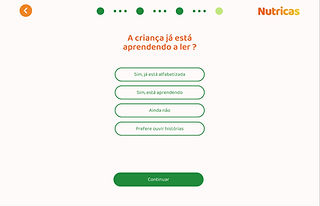


Onboarding flow for mobile
Home post login
Home post login on the computer opens directly to the home page, while the app opens a tutorial teaching how to access other functions. In this area of the home, the user has access to Games, Stories, Exploring, Recipes and Videos, as well as settings, caregiver space and medals.

.png)

The games part was designed to be educational fun with activities such as quizzes, puzzles, choices, connection games and labeling, all for the child to learn through play.
Games
The videos were designed to stimulate creativity, also thinking about recipes and curiosities, in addition to the animations about fruits and vegetables.
Videos


.png)
.png)
In stories, the child has access to several stories about harvesting, vegetables, nutrition and everything that involves a balanced and colorful diet.
Stories


In the recipes section, children will find several delicious options to prepare with their parents. Recipes are categorized by level of difficulty, making it easier to choose the ideal option.
Recipes


.png)
.png)


The "Exploring" area was created as a fun dictionary of vegetables and fruits, where children can learn about harvesting, nutritional tables, benefits and interesting facts.
Exploring
.png)
Gamification
Gamification is a crucial element in keeping children engaged in the app. By implementing a system of medals and cards that children earn by completing tasks and exploring the application, the experience becomes more fun and motivating.

.png)
Final Design
Access the prototype of the application and its functionalities in this plugin below. If you want to access the prototype of the website, click on this link.
Results
The main objective:
Create a website and an app for children to learn more about nutrition, improving their diet and lifestyle. It is known that "we are what we eat", so the objective was to develop a creative and fun application so that children, from the earliest stages, are introduced to correct and quality food, so that in the future they can have a better and more conscious life as adults
Solutions:
-
The main solution was the creation of an Onboarding designed to promote a more pleasant experience for the child and their needs.
-
Responsiveness was also very important for the project, as it meant that the application was used with different types of users and devices in mind.
-
From the research it was also observed that many children do not even know many fruits and vegetables and the application also appears as a way of making this knowledge more fixed in children's heads.
-
Learning through play, children need to be taught and one of the best teaching methodologies applied to little ones is through games and entertainment, thus fixing information in a playful way.
-
Some guardians use parental control on their devices and one of the ways for caregivers to know directly where and how long their children have been online is through the Caregiver's Space, also bringing achievements and medals acquired through games.
Next steps:
-
Develop more configurations
-
Improve accessibility strategies such as allowing fonts to be enlarged directly in the app
-
Develop games and more features within the application
-
It would be important to further improve gamification by creating daily challenges and weekly goals.
-
As it is a case study there is no need, but considering that this was a real project, it would be important to create documents to send to the application and website developer.
Lessons and learnings
-
I learned a little more about education and pedagogy.
-
I researched a lot about gamification and how safe sites are for children.
-
I created even more complex components, in addition to the animations in figma.
-
I understood even more how to conduct usability tests and how to behave in relation to receiving feedback
