

NoTom - Case study
NoTom is a responsive website, accessible on both web browsers and mobile devices, for an online music school.
Project duration:
3 weeks
Target Audience:
Adults and young people with little time, who want to learn music in a fun way and adapted to their needs.
My role:
UX Designer; Creating the entire application from the beginning to the end of the project.
Responsibilities:
In the project, I led the conceptualization, competitive audit, creation of wireframes, usability study, low and high fidelity prototyping, among other crucial details of data analysis.
The problem:
The project was guided by these three questions
-
How can the study of music, which is often a leisure activity, be transformed into something that can fit into a routine?
-
How to create a platform that engages beyond classes, creating communities and enabling users to get to know and strengthen each other?
-
How to make such a complex website into an easy-to-use platform for both mobile and computer?
Goal:
Prioritize serving people who have little time or mobility difficulties to attend a physical music school, but who still want to enjoy a private teacher. The platform aims to provide autonomous learning through a library of available scores and video lessons, in addition to offering events to connect students and users through music.
Research
"Many of those who acquire a new instrument tend to stop within the first year. It could be due to lack of encouragement or accessibility, inability to play the songs they want, being overwhelmed by mistakes, and so on."
Startups Magazine - Why you should not give up the instrument you learned and how to stay persistent.
50 %
50% of all students drop out of music lessons and other musical activities by the time they turn 17
Pesquisa: Ruth N, Müllensiefen D (2021) Survival of musical activities. When do young people stop making music?
Seeking user understanding
From desk research it was possible to deeply understand that the main cases of giving up playing music are related to the lack of motivation and time available to practice an instrument. Therefore, to better understand users' needs, two personas were created.
.png)
.png)
Competitive audit
Striking visuals
Strong points
Few teachers in Brazil
Need to improve
Possible to see about the teacher's diplomas and courses
Much information can only be viewed if the user logs in
Teacher ranking
Teacher introduction video
Good description of the lessons
You can contact the teacher directly
Relevant information about each teacher
Problems regarding accessibility when viewing teachers in the
Lots of information is available just by logging in
Need to improve
Functional page view
Pontos fortes
Good site navigation and good first impressions
Has social proof from teachers
Teachers of many modalities available
It is not very clear whether the teacher works remotely or not
Good navigation
Few specifications about the teachers who will teach the classes
Need to improve
Multiple courses available
Strong points
Well-designed and pleasant home
Course prices are not available
Good use of contract and accessibility
Lacks interactive video material
Barra de navegação confusa e com muitos itens
It doesn't have a good visual identity which makes the website a little confusing
Need to improve
Many courses both online and in person and have studio, services and events
Strong points
Good website navigation
Well described information
Using too many fonts on a page creates visual clutter
The site has many resources, which at first glance makes the site look like an amateur.
.png)
Sitemap
Preliminary drafts
The wireframes were important, as it ended up being a moment in which I could reflect more on the information I had previously collected and put it on paper and how to create an attractive visualization that would make the user feel motivated to practice their musical instrument .


Sheet Music Library
Video classes
Classes profile

Plans
Student area

Teacher Profile
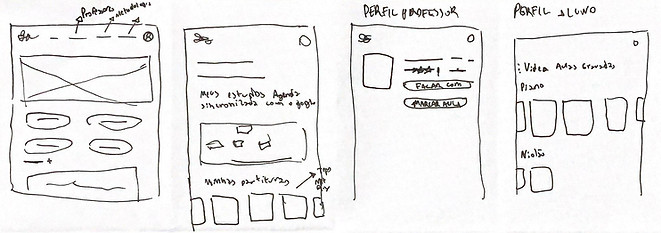
Home
Plans
Teacher profile
Student profile
Responsiveness matters
The digital wireframes part was important to see how the site would behave in terms of responsiveness and understand how certain mechanisms should be changed to work on both the computer and cell phone.
View the digital wireframes for the web at this link
.png)
View the digital wireframes for mobile at this link
.png)
Home and navigation
Thinking about making the journey easier to visualize, a drop-down menu was created on the desktop website. When accessing it on a cell phone, the hamburger menu was the best option, leaving the site clean and making it easier to access each item.


Computer/tablet
Cell phone
Hamburger mobile menu
Teacher profile
The teacher's profile was designed to be a place where the user can view the main descriptions of the teacher's work, as well as presenting interesting facts that can connect the teacher with the student, such as their favorite songs and bands.


Profile save and share button
Photo | Name | Pronouns | Musical instrument
Details of assessments, values, languages and work availability
CTA buttons
Computer/tablet
Cell phone
Current plans
Area on the home page showing the available plans, and therefore what is included or not in each available plan
Good navigation


Cell phone
Horizontal scrolling allowing viewing of all plans
Student space
Area designed to cover all the needs for independent study, containing video lessons, materials, purchased plans and sheet music libraries to study the sheet music on a daily basis.
_edited.jpg)
Sheet music that is being most accessed by users
Computer/tablet

Student space main menu
.png)
Hamburger Student space menu
My classes | Events
Student area showing events and calendar with upcoming classes, allowing the user greater control over their routine.
Computer/tablet
Cell phone


Events for users to connect with people with similar goals
Calendar with scheduled classes
Crafting the form of the website
A blue color palette was selected for the website design, aiming to convey professionalism and confidence to visitors. Furthermore, through website development, it is possible to better understand how the system works.
The homepage was designed as a central location, accessible from almost all paths within the site, thus allowing the location of teachers, plans, information about the site and the creation of NoTom, as well as its differences.
Home
Methodology
In this part of the website, the mission of the website is presented, as well as the idea of how NoTom works in practice, providing users with good navigation and autonomous and individual teaching.


Available Plans
In the plans section, it is possible to understand how the plans work and how users can choose the best one for their needs, since plan calculations are made based on the hourly class fee of the chosen teacher.
Teacher profile
The teacher's profile was designed to provide as much information relevant to the decision to hire the teacher, from student comments and evaluations to curiosities about musical preferences, as well as their values and videos of performances, all so that the user can do a choice based on evidence.


_edited.png)


For login, we opted for a simple design that really highlights the information to be filled out.
Login


After logging in, the user will be directed to the Student Space 'home', where it is possible to find highlighted scores, events to connect to and the calendar of upcoming classes in the plan.
Welcome to the Student Space


In this space, the most viewed videos were added, in addition to video classes relating to the course the user is taking with the private teacher.
Video classes


It is a place where the teacher's documentation information is stored, in addition to the scores that the user saved and the last video lessons viewed.
Your materials
Estudo de usabilidade
In the usability study, the focus was on the users' experience, as well as on understanding the site and using the student area, in addition to considering the design.
To this end, we carried out a moderate usability study remotely, conducted in the homes of the 3 participants analyzed. We prioritized two main problems to be corrected in order to improve the site's usability.
1
The navigation order was modified to give priority to the items that users accessed most in the usability study, making navigation on the site easier. We identified that users more frequently accessed sheet music and video library items, while plans and my materials acquired the characteristics of being reference material that would be used casually.
2
The usability study identified the need for a notice to inform students about the start of classes and messages from teachers. To meet this demand, a notification was implemented on the main scroll of the student space.
Before the usability study

.png)
After the usability study
.jpg)
Notifications
After the usability study
Final design
After carrying out the usability study, it was possible to improve some aspects of the website, as well as its design, and with this solution, we obtained a result that was more aligned with the user's needs.
In this plugin below you can access the entire final design for the website or click on this link.
Results
The main objective:
Develop a website designed for more autonomous and personalized learning for the user, creating a community that motivates and makes the user not feel alone in their learning process. Furthermore, one of the objectives is to make learning more fun, and we believe that having something in common with your teacher can be half the battle to learning by talking and sharing knowledge.
Solutions:
-
Understanding the plans was crucial, so one of the focuses was looking for ways to demonstrate how to best use the site.
-
Something important was also the creation of the teacher's profile, thinking about the user's choice through evidence and identification - from favorite songs to videos of their latest presentations, in fact showing a portfolio of competence and connection with the student.
-
A highlight of the project are the tabs after logging in and purchasing the plan, thinking about how the user could become more engaged with studying beyond the contracted classes, making any moment productive for studying music.
-
From the research, it was observed that the lack of motivation is a common theme among musical instrument players. Based on this, it was very necessary to create a safe environment among students in which they could share their growth with other students through online events.
-
Organization is also a crucial factor for learning, so I added a calendar that could be fed not only automatically with class scheduling, but also for day-to-day organization.
Next steps:
-
Develop the purchasing part of the plan, including the entire cart and checkout process.
-
Implement student support.
-
Integrate a direct chat with the teacher.
-
Develop a forum for students to discuss topics.
